
Features
Feature sections that explain what your product does, with icons, images, and motion. 3 blocks._
Six icon cards under a centered intro, with one soft highlight that glides to the card you point at.
Everything you need to ship the page
Open code components you can read, change, and keep. Start with good defaults, then make every detail fit your product.
Code you own
Components install as source files in your project, so nothing is hidden behind a package.
Fits every screen
Layouts adapt from phones to wide monitors with Tailwind's responsive utilities.
Keyboard friendly
Focus states, labels, and keyboard support come built in, not bolted on later.
Typed end to end
Every prop has a type, so your editor flags mistakes before they reach production.
Easy to restyle
Change colors, spacing, and copy through props and CSS variables, not overrides.
Light on dependencies
Most blocks need nothing beyond React, Tailwind, and a small utils file.
Heading and two actions above three cards that pair an image, a short explainer, and an icon tile.
Turn your data into pages people act on

Live dashboards
Drop in charts that update as your data changes, with tooltips and legends already wired up.

Reports that explain
Pair numbers with clear visuals so the whole team reads the same story from the data.
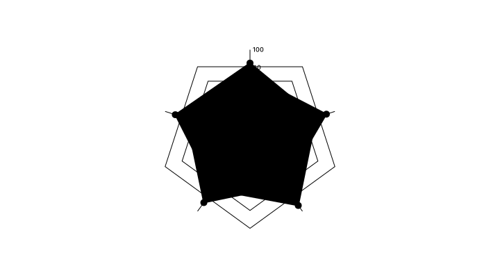
Share in one click
Send a link or embed a view anywhere, and every viewer sees the latest numbers.
Label, headline, and intro over three image columns, closed by one shared call to action.
Features
Answers your team can see
Clear visuals for the questions that come up every week, ready to drop into your product.

See the whole picture
Break any total into its parts so you can tell at a glance where the growth comes from.
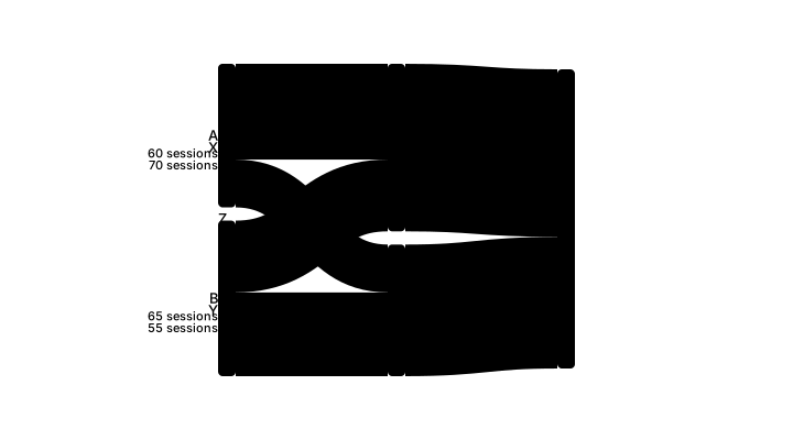
Follow every flow
Trace how visitors move from first click to checkout and spot where they drop off.

Track the goal
Put the one number that matters front and center, with progress everyone understands.